Facebook Design System (FDS) is a set of coded components that enable 500+ designers at facebook to follow a cohesive design language – making the Facebook app easier to use and understand.
The system is comprised of 23 components and 9 primitive values (color, shadow, type, etc.) engineered on 5 platforms (Litho, Objective C, React Native, React Web, and Native Technologies), with supporting documentation and usage guidelines. In order to support more than 40 cross-functional teams in building a wide variety of products, each with separate goals, we maintain a flexible UI system that we call "Core UI."
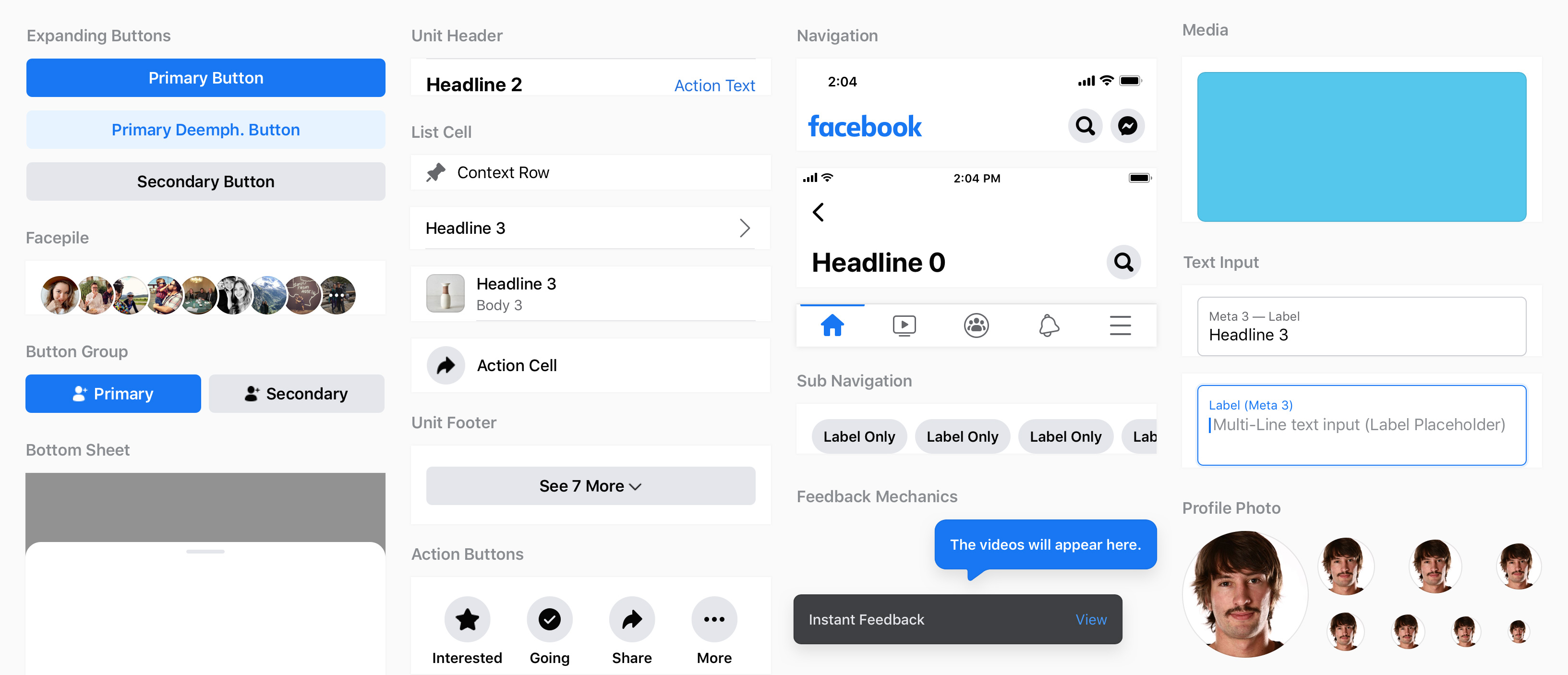
Components
Our Core UI is based on atomic principles, but each molecule has different potential complexity. Because teams use these components to solve an array of problems, we defined extension points for each one. These extension points are an API that allow teams to pass in any other core component, or custom element, at a point defined by FDS design.
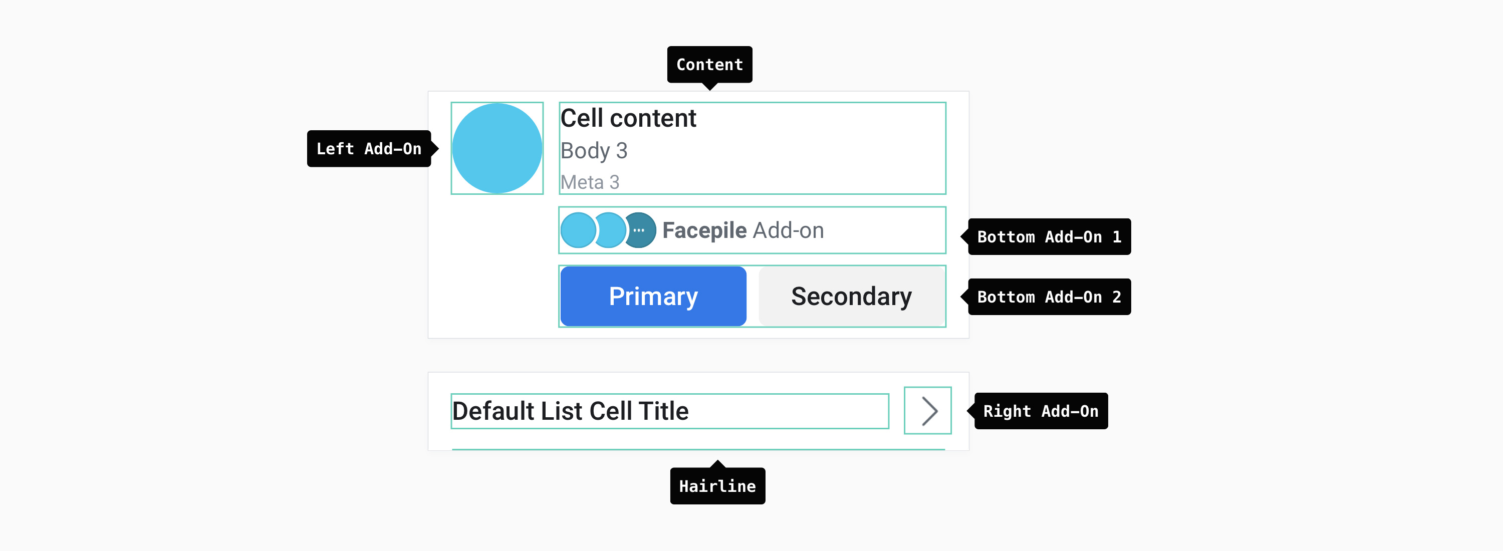
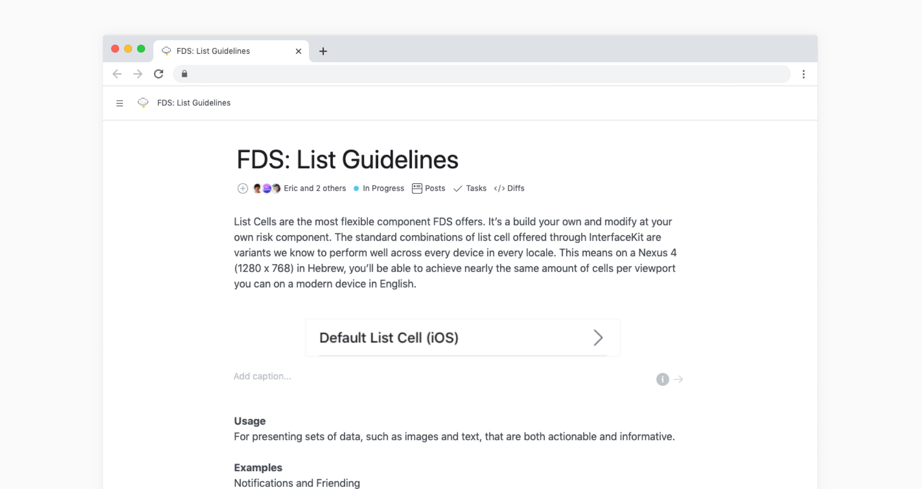
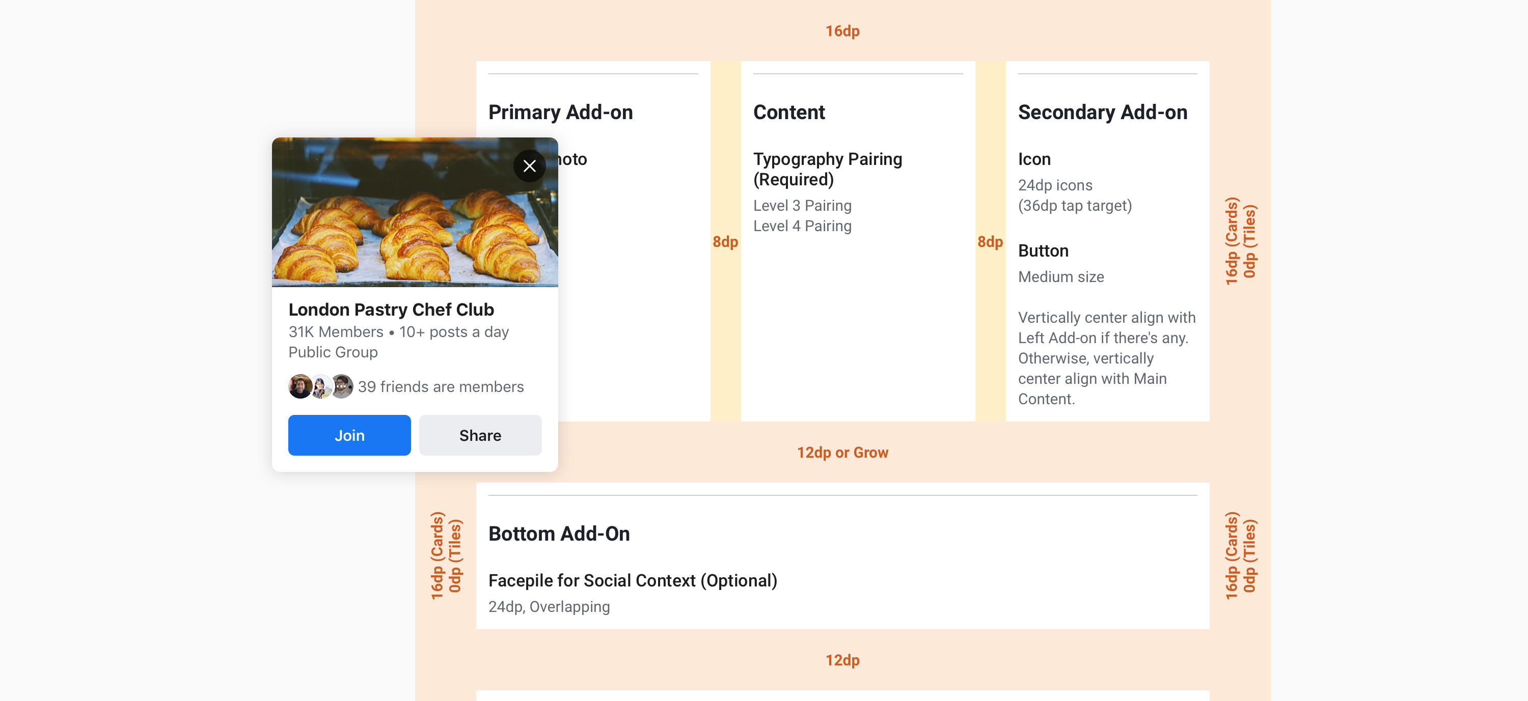
A [List Cell] for example will allow up to four add-ons from the core UI library.
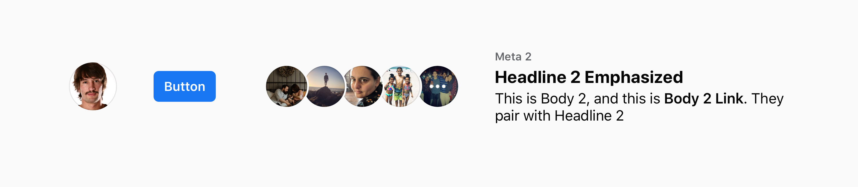
Basic List Cells
The extensibility of our system is defined by patterns that exist in the app and limited to the elements we identified as core, but teams continually find a need to create something new. These can be extension types we didn't anticipate, or changes to the core component, like: size, color, and placement of elements.
To enable teams that want to make these changes to the system, we introduced: Override IDs — a unique code hook for each customization, that allows FDS to track them. We use these to inform future iterations of our Core library, and provide relevant test data for teams looking to make similar changes.
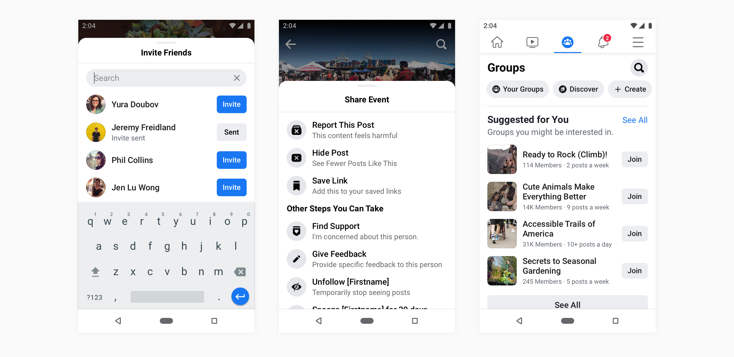
List Cells
As we introduce more complexity to the system, we needed to find ways of mitigating the cost for engineering. Each component was given a complexity rating that helped our team assess where to invest more effort.
• Design complexity — the amount of documentation, guidance, and education a component requires to be used successfully.
• Engineering complexity — the extensibility of the coded component analogous with the number of points that design has outlined in usage guidelines.
As the complexity of the component increases, the support that FDS provides shifts from engineering to design. This means that as the engineered component becomes more “flexible,” the Usage Guidelines become more robust. The Usage Guidelines are guard-rails from design that allow engineering to account for more anticipatable outcomes and reduces the engineering oversight needed to successfully adopt our coded components.
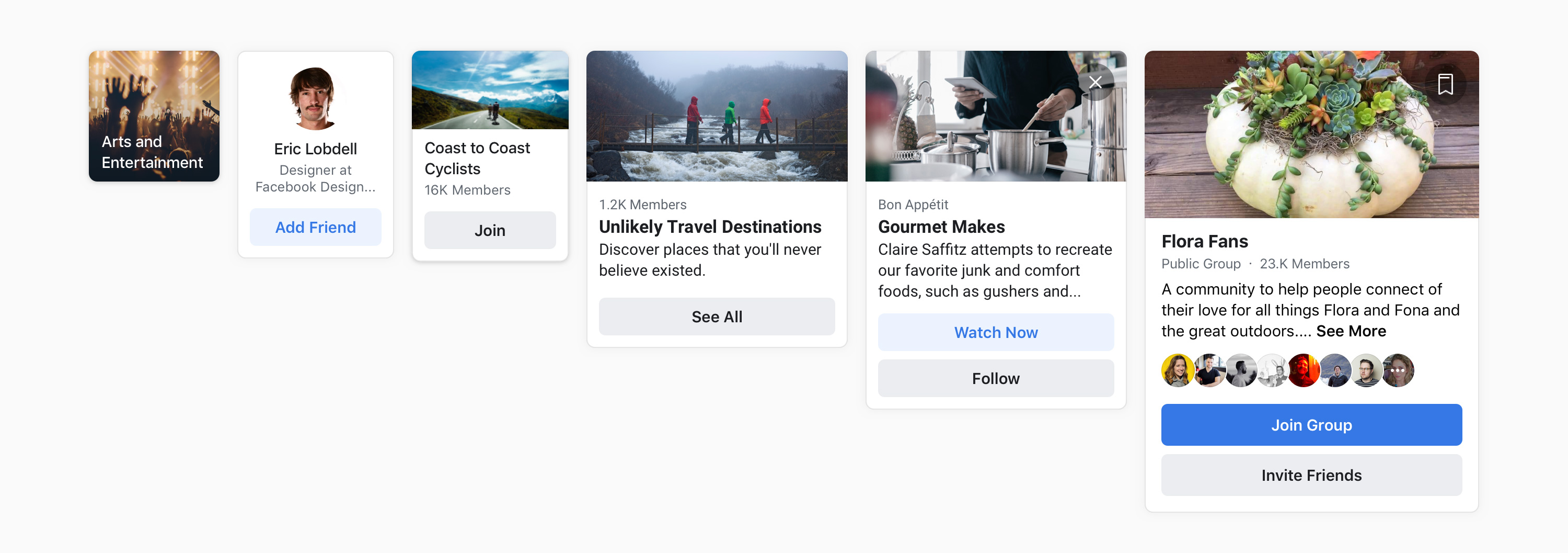
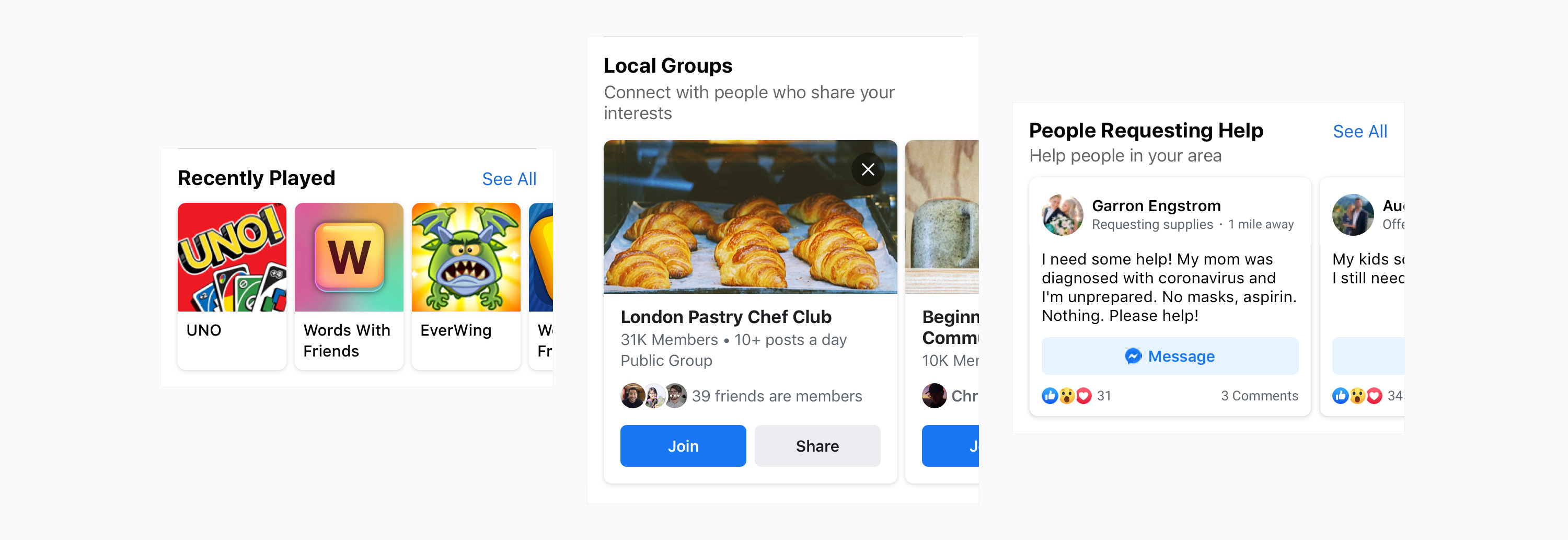
Gaming / Groups / Covid-19 Center
Among the components showcased above, List Cell accounts for nearly 45% of all designs in the Facebook App. It's arguably the most touched element in the history of digital UI, only second to our Primary Button — the blue one — which receives over 7.3 million touches an hour.
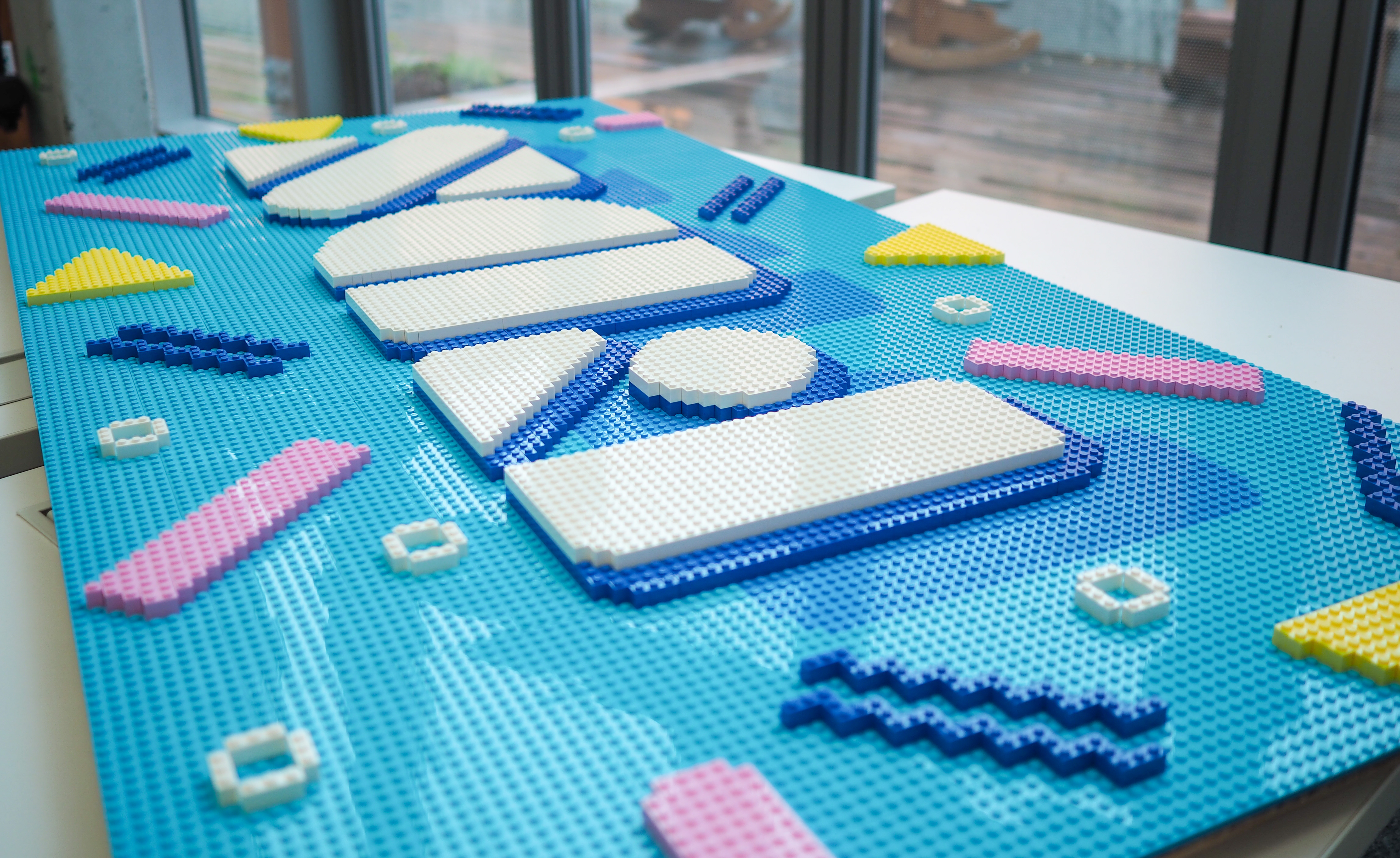
As part of a team workshop I was hosting: I designed a LEGO wall that measures 6 feet in length and 3 feet in height. I painstakingly placed over 3,713 digital bricks, by hand, to create the printed instructions and calculate a spreadsheet of pieces to order. 18 people constructed individual squares (12x12), that when combined resulted in a 90s pool party FDS logo; a lot like how UI systems come together. I'll never recommend this process to anyone, nor will I admit to how long it took me.