Circa 2016 Apple released iOS 10 championing an all new modern design language. The UI design industry was departing from an era of "flat design" and embarking on its next trend. Over the course of two years mobile apps began to adopt similar patterns of larger type and massive drop shadows.
As these styles became more common-place, designers at Facebook slowly began introducing them throughout the app. In 2018 the Facebook app was still identifiable by the large blue navigation bar across the top; present on both mobile and web. It was clearly behind the times.
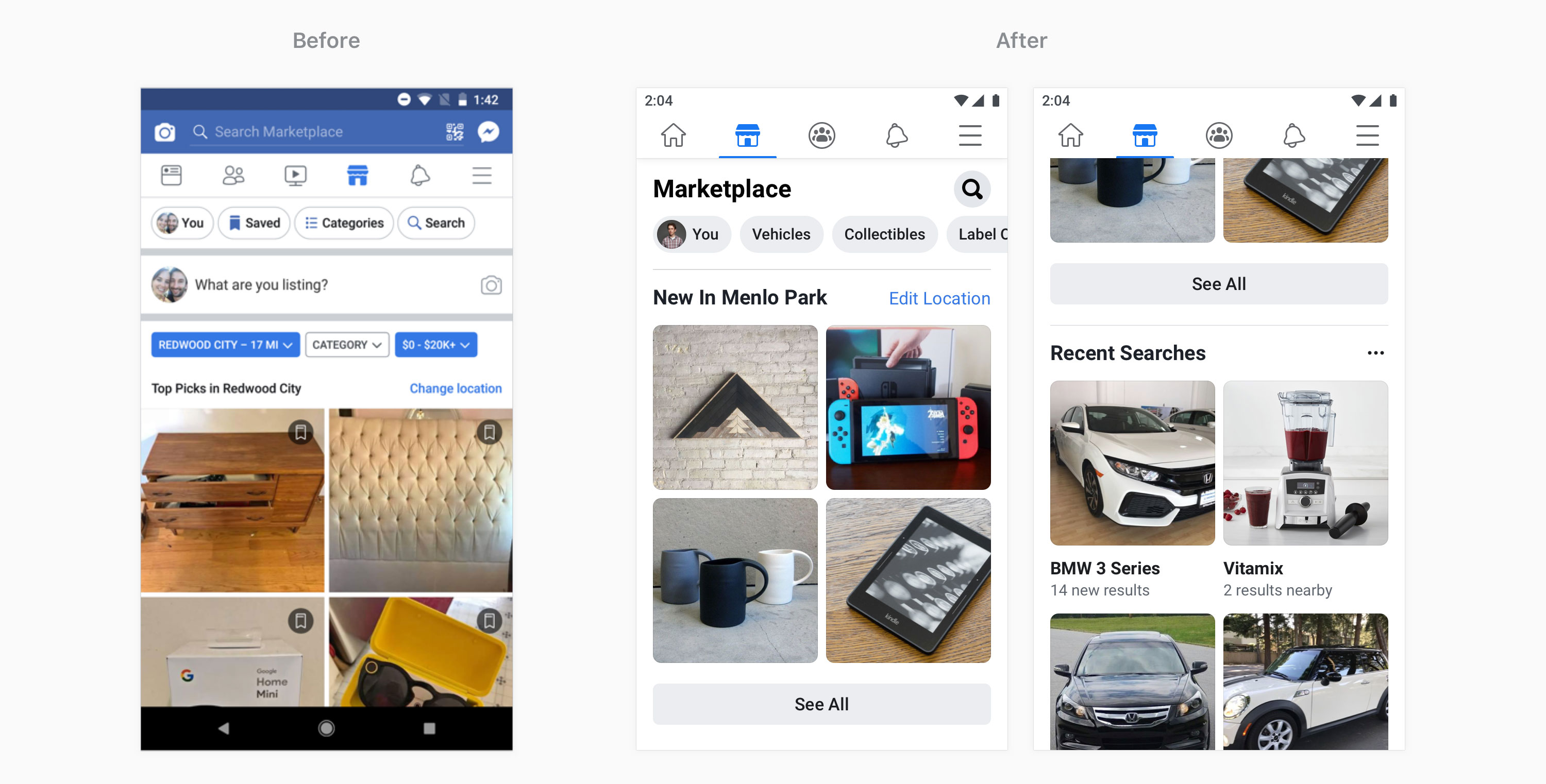
Marketplace
My team, the Facebook Design System — lead by Chris Welch, rallied with teams across the company to understand the people problems these visual styles were solving. The patterns that emerged were boiled down to three principles: clarity, predictability, and performance.
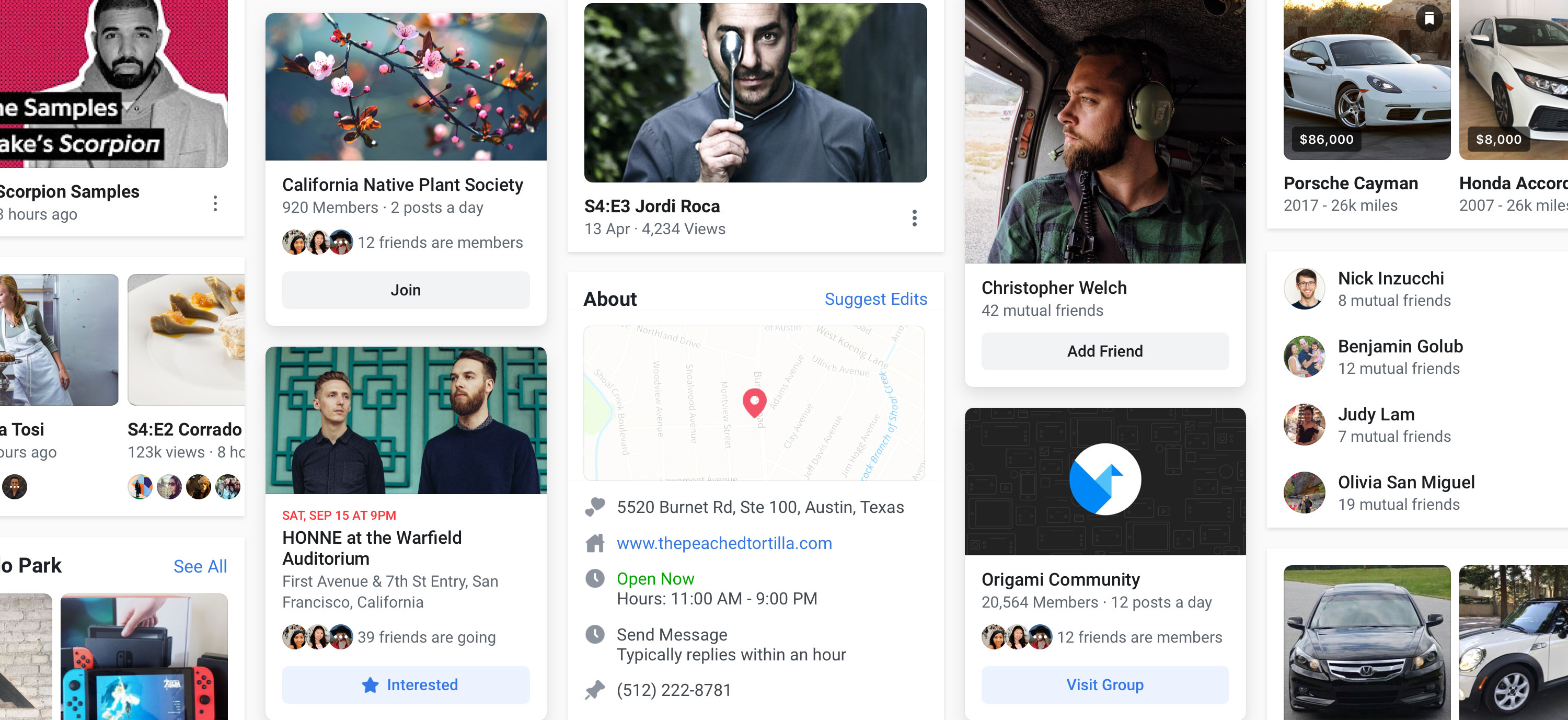
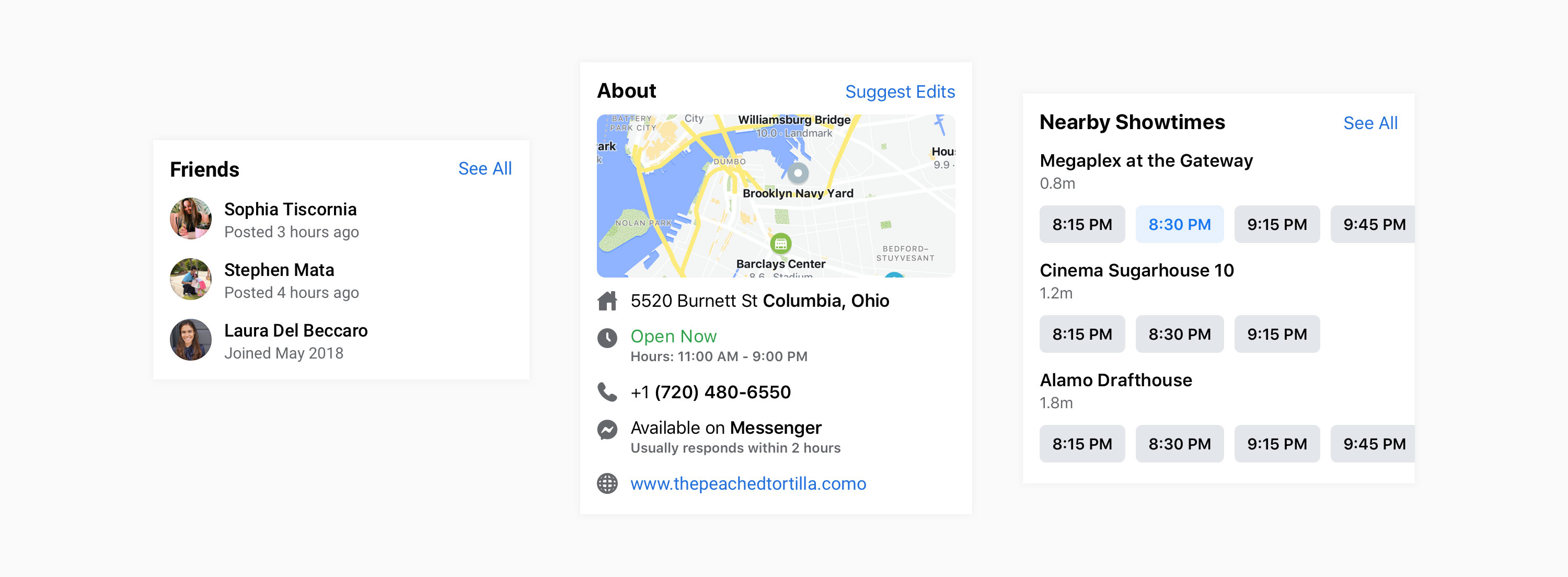
To introduce these patterns app-wide, we created a framework that every team could adopt to provide clear signposting, structure content in a predictable format, and improve app performance (both top line metrics and perceived speed). This structure is called a "Unit". Every Unit begins with a header, follows a clear typographic hierarchy, and prioritizes content for an optimized thumb-scrolling experience.
Lists and H-Scrolls
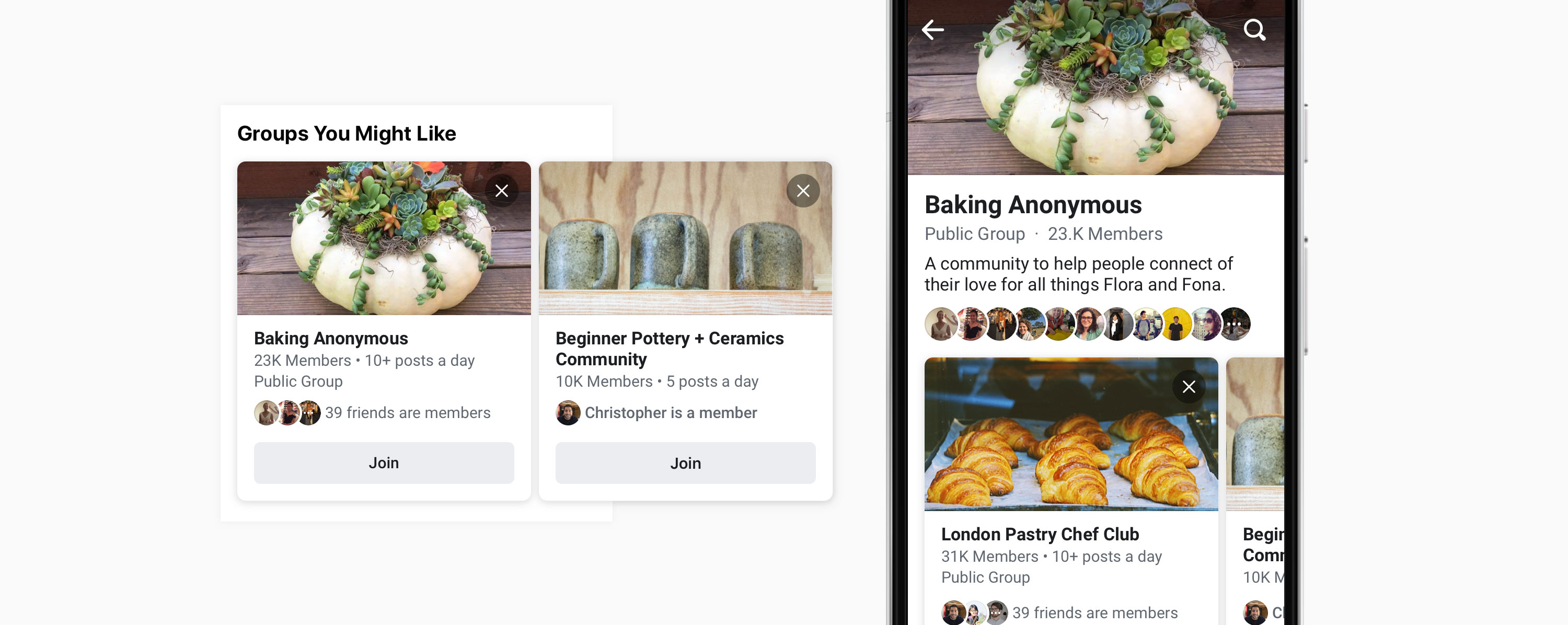
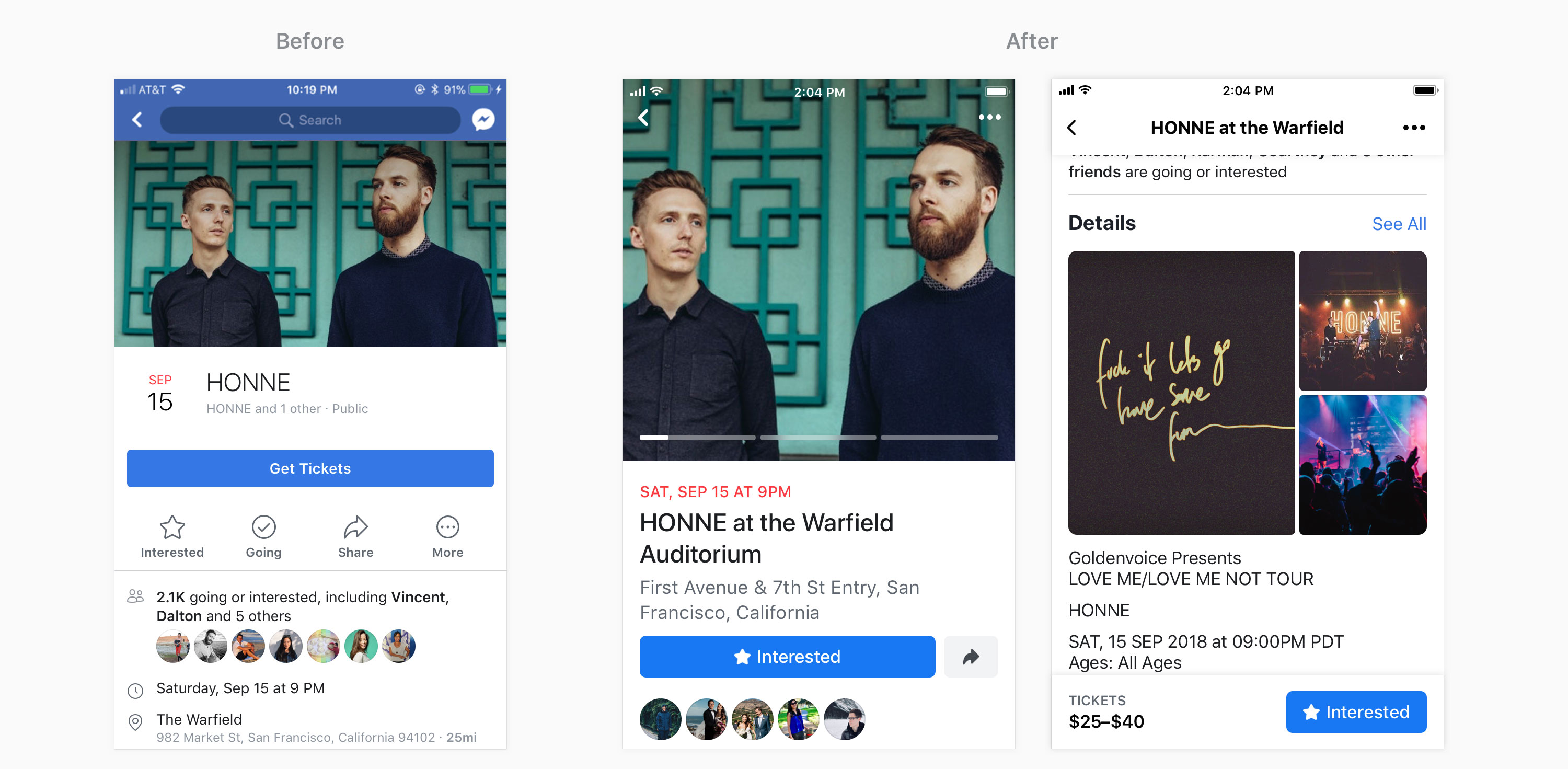
Teams often need a means to promote content and surface larger visual elements. To address this, we created a horizontal-scroller (H-Scrolls) that leverages cards and large shadows. These visual cues are an affordance for scrubbing side-to-side, but also set the stage for a seamless transition from card to full-screen experience. The H-scrolls, with expand-in-place cards, are what we categorized as a "discovery" mechanic.
In order to ship this massive change across every team at the company, I spent a full year hosting workshops to help teams understand the principles and UI mechanics, re-designing their surfaces, and creating test plans that would enable them to iterate toward a complete redesign.
Events
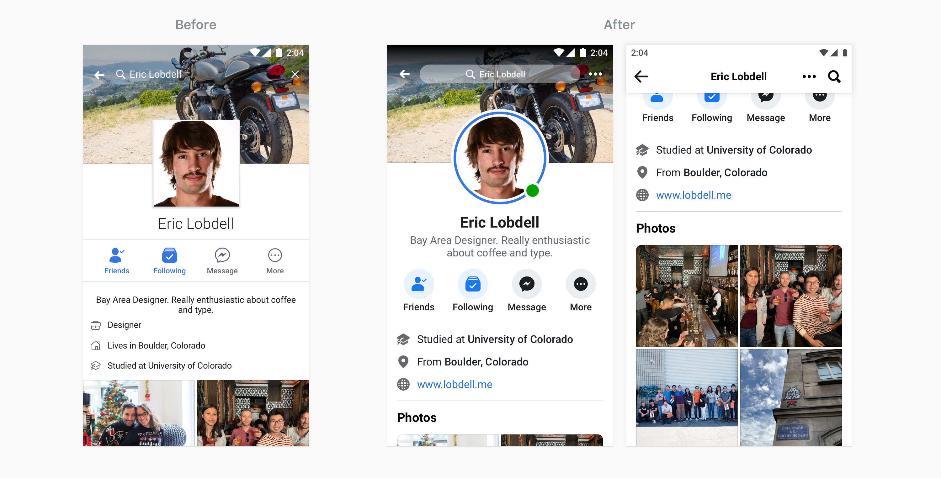
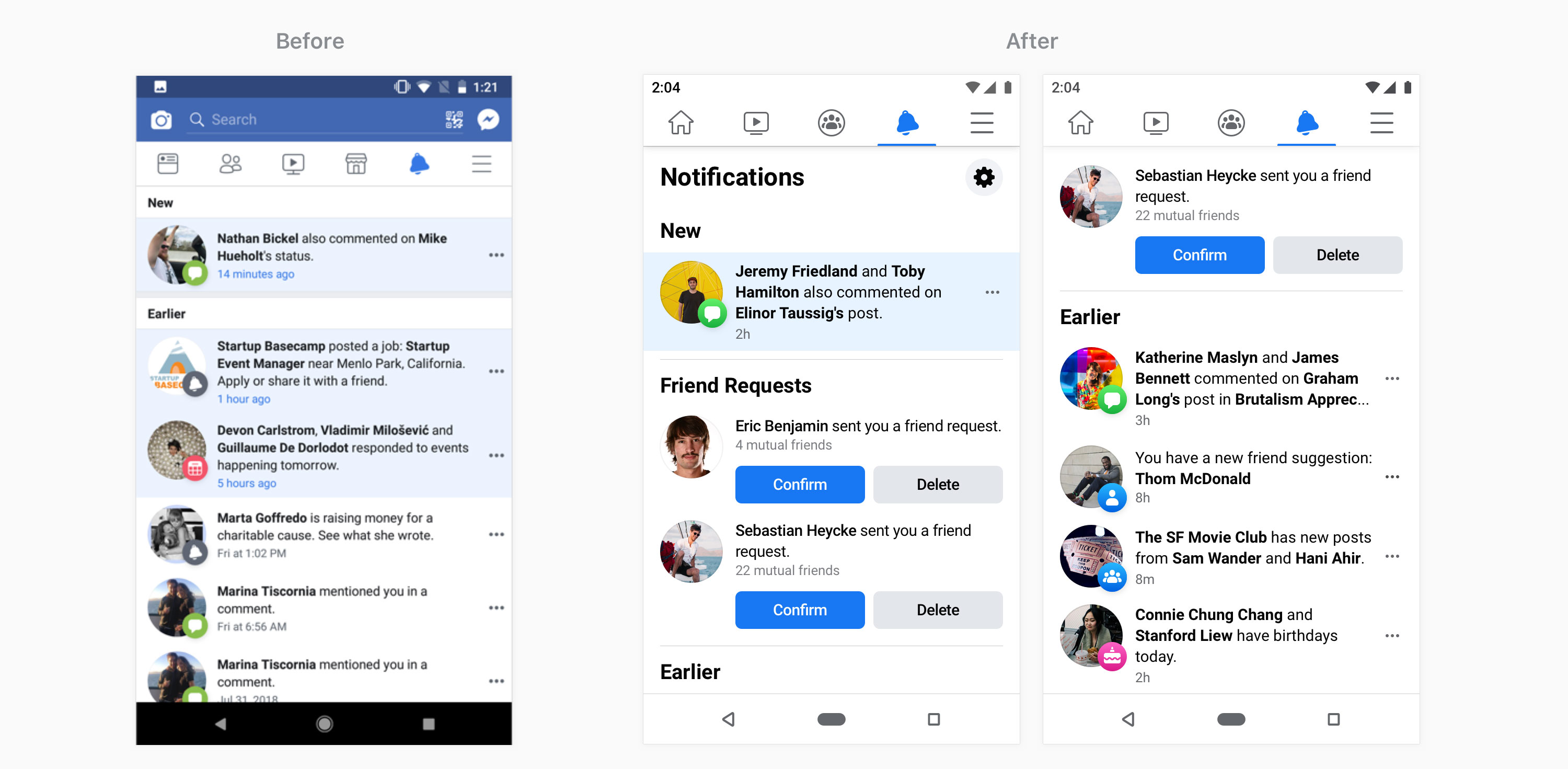
There’s a big difference in the before and after designs shown above, but most notably there’s no longer a blue bar across the top.
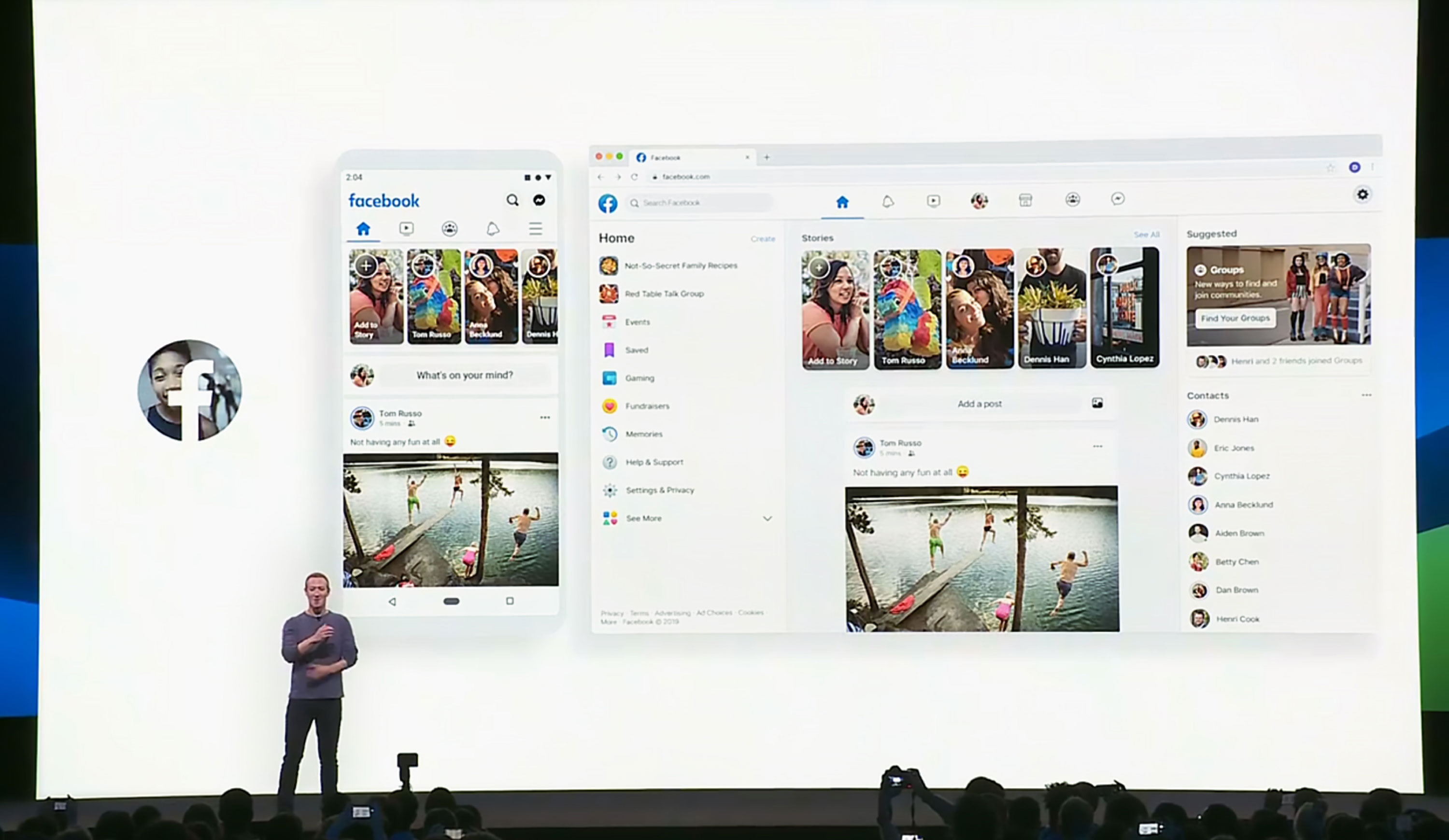
Our design system, now refreshed, was also used for complete re-design of the Facebook web experience. The end result is what you see today (June 7, 2020) on both mobile and web. All of this work, dubbed “FB5,” was presented on stage at Facebook’s 2019 keynote: F8, by Mark Zuckerberg, himself.